Nimbus is a collaborative whiteboard built for remote teams to think together, move faster, and stay clear—turning messy ideas into organized momentum without the “blank canvas” friction.
Wordmark
Nimbus is built for momentum—and our logo reflects that. The symbol is a rounded spark that signals action and movement, paired with a grounded wordmark that keeps the brand clear and trustworthy.
Symbol
Nimbus symbol is a rounded lightning/spark. A simple shape shape designed to feel energetic without looking aggressive. It represents ideas turning into action.


Logo Usages
Nimbus symbol is a rounded lightning/spark. A simple shape shape designed to feel energetic without looking aggressive. It represents ideas turning into action.


Colors
Nimbus uses high-energy neon palette to signal speed and collaboration. Neon is treated as a brand signature used boldly in hero moments and sparingly in UI so the product stays clear and readable.
Mint Green
#00EC77
Black
#191919
Secondary Green
#00CA2C
Lime
#DDFF00
Dark Gray
#BFBFBF
Gray
#F4F4F4
Typography
Across the nimbus brand and products, we use Inter Display
Inter
Display
Inter Display
Regular
AaBb123#
Inter Display
Medium
AaBb123#
Inter Display
Bold
AaBb123#
Gallery
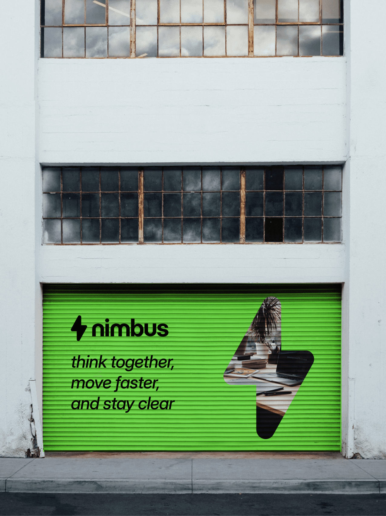


made by realvjy in framer